The archetype for Final Fantasy logos, beginning in Japan with Final Fantasy IV and in North America with Final Fantasy VII.
The logos for each Final Fantasy game have a similar style. Starting with Final Fantasy IV, all game logos feature the same basic layout. The older games also received logos in the same style when they were re-released. The font used to for the title is Runic MT Condensed.
The logo art for the main series games, and for many spin-offs and sequels, is by Japanese artist Yoshitaka Amano who has been involved with the Final Fantasy series since its start. The games are in development when the logo requests are sent to Amano without much documentation to go by. Amano then interprets the information available and tries to incorporate it and create an illustration out of it. As the logo art is based around a central concept, not much of the important aspects would drift or change significantly even if the logo is created early in production. Because the title logo is monochrome to a certain degree, Amano illustrates the logo as a standalone piece of art. Rather than receiving visuals, Amano creates the character illustrations from text-based information, like the age and the role they play. As he is not a character designer, but an illustrator, there are more instances where he has worked off text received from the development team. He has said that anything written in text builds and expands imagination, whereas visual assets to review or look at, would be "the end of it."[1]
After Amano has drawn the logo art the actual logo is designed around it by the design team that chooses the color for the logo, among other aspects. Square Enix likes to reflect colors from the logo art within the key art. For example: The green and blue of the Final Fantasy VII Meteor logo, are also reflected in the Mako energy and Lifestream that play crucial roles in the game, and the tone of the key art.[2]
Main series
- Final Fantasy
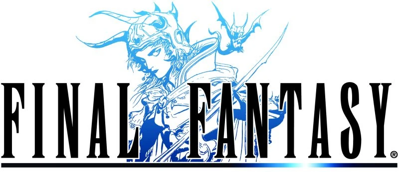
The logo for the original Final Fantasy shows the title in a simple light blue font with semi-transparent characters. It was the only time the title was entirely in katakana, rather than primarily English letters with a kana subtitle. The English logo is done in a custom font, slightly bolded, in red. The logo of the re-releases, starting from Final Fantasy Origins for PlayStation, features a Yoshitaka Amano drawing of the Warrior of Light in light blue. In Dissidia Final Fantasy, the Warrior's appearance and pose during his EX Burst mimic this logo's artwork. The logo was redesigned again for the Final Fantasy 20th Anniversary version of the game for the PlayStation Portable. It still features the Warrior of Light. This logo is also used for the mobile versions.
Template:Gallery
- Final Fantasy II
The original logo for Final Fantasy II is done in a colorful italic style: the writing is done in pale-purple fading into bright blue, the edges the letters are rimmed with gold, while the numerals are in a medium-to-light blue. The whole is styled vaguely in the shape of a dragon, emphasized more by the red reptilian eye incorporated into the first letter.
The logo of the Final Fantasy Origins and Final Fantasy I & II: Dawn of Souls re-releases features a Yoshitaka Amano drawing of The Emperor in pink. The logo was again redesigned for the 20th Anniversary PSP release, still featuring the Emperor. This logo is also used for the mobile releases.
Template:Gallery
- Final Fantasy III
The logo for Final Fantasy III features the title in an italic orange font, and three crystal columns in the background. The letters are styled almost exactly like the previous game, only this time they are all-gold. The logo of the Nintendo DS re-release features a Yoshitaka Amano drawing of an unnamed Warrior of Light holding two swords in greens and blues. In Dissidia Final Fantasy, the Onion Knight strikes this pose during the Ninjutsu version of his EX Burst. This logo has been used for all following versions of Final Fantasy III.
Template:Gallery
- Final Fantasy IV
The logo of Final Fantasy IV features a Yoshitaka Amano drawing of Kain Highwind in purple, posing in a shape of number four in Arabic numeral. The color of the text matches the color of the drawing. The logo marks several things: it adopts what would become the "standard" design of the title logo, with the title in English and a katakana subscript and incorporating a piece of Amano artwork between or near (in this case, between) the "Final" and "Fantasy." It adopts the "standard" font for the series going forward, abandoning the stylized italics of the previous logos, and the font also seems influenced by the font of the American edition of the first Final Fantasy with a similar A, N, I and L (though with less elaborate Fs and a much narrower T). This overall design would become the standard for nearly every release to follow.
The logo of the North American release was done in a gilded style in a typeface similar to the English logo for Final Fantasy, but with somewhat less elaborate Fs (though they retain the distinctive tapered tail), narrower Ns and As, and most prominently a T which takes the form of a sword. The numeral was also changed from "IV" to "II" to avoid continuity issues. The logo for the WonderSwan Color release incorporated a gradient. This was the basis for the Final Fantasy IV Advance logo. The Japan-exclusive mobile phone port features a different shade of purple.
The sword model that replaces the "T" in the North American localization of Final Fantasy IV (written as Final Fantasy II) is identical to that in the logo of Final Fantasy Adventure, Final Fantasy Legend II, and Final Fantasy Legend III, right down to the lens flare.
The Nintendo DS version had a redesigned logo featuring Golbez. The new logo wasn't a concept that pre-existed from the original. Amano has later described the logo as "cool" and said the designer making the logo based on his illustration did a good job merging them. The Golbez illustration was originally ink art, but the logo designer at Square Enix added red in it. Amano himself enjoys dark, boss-like characters, and tends to lean toward these types of illustrations.[1]
Template:Gallery
- Final Fantasy V
The logo of Final Fantasy V features a Yoshitaka Amano drawing of a wind drake in purple and light blue. The text is a dark blue and the "V" strays from the traditional font style.
Template:Gallery
- Final Fantasy VI
The logo of Final Fantasy VI features a Yoshitaka Amano drawing of Terra Branford atop a Magitek Armor, depicting an event when she was in the thrall of the Gestahlian Empire. The armor and its rider are in black and red, while the text is black, from here on becoming standard for the series. Amano considers the logo memorable as at the time was Terra was one of the first female main characters in the series and the logo is just the silhouette without actual faces and lines; Amano describes early logos in the series as more simplistic that gradually became more illustration-like.[1]
The logo of the North American release, done in the exact style of the Final Fantasy "II" English logo, changed "VI" to "III" to avoid continuity issues. While the box of the SNES release retains the "sword T" that had been used in "II", Adventure and the Legend releases, the logo in the game itself is instead a "normal" T with a thin, slightly stretched top which touches the N and A, in a manner reminiscent of the T in the first North American Final Fantasy logo.
Template:Gallery
- Final Fantasy VII
The logo of Final Fantasy VII features Meteor in varying shades of turquoise. The smaller stone may be a piece of Materia. The green and blue of the logo set the theme for the color tone for the rest of the game as well, reflected in the Mako energy and Lifestream that play crucial roles in the story.[2] Amano has described creating the Final Fantasy VII logo as a challenge. He drew many variations and concepts around the Meteor motif, and in the end wasn't sure if it was good and thus let the developers choose the final version.[1]
In Final Fantasy VII: Advent Children the town of Edge has a Meteor monument that resembles the logo. The logo of Final Fantasy VII: Advent Children is also a stylized version of the original Final Fantasy VII logo. The game marks the point the same logo and numbering was used worldwide.
Template:Gallery
- Final Fantasy VIII
The logo of Final Fantasy VIII features a red and orange drawing of Squall embracing Rinoa. The two assume the pose in-game during a scene at Sorceress Memorial, which is alluded to in the opening cinematic. The team knew that the Rinoa and Squall scene was going to be a a big moment in the game, so they asked Yoshitaka Amano to draw this for the logo. The red to yellow gradient reflects the sunset in the background of the moment Rinoa is falling to Squall's arms in the opening cinematic.[2]
Template:Gallery
- Final Fantasy IX
The logo of Final Fantasy IX features the Crystal from which all life originates in shades of gold. The game number matches the crystal's color.
Template:Gallery
- Final Fantasy X
The logo of Final Fantasy X features Yuna performing a sending at the Kilika Port in a variety of vibrant shades, reminiscent of the iridescence of pyreflies also crucial for the scene the logo depicts. It is the first to officially bear Amano's signature, visible in the bottom-right corner. Like Final Fantasy V, the "X" strays from the traditional font style.
There also exists a scrapped logo from the Square Millennium Event trailer. Yuna's face is seen on the left, facing the beholder, with her right hand raised upwards, and the profile of a large airship in the background. This image is taken from the 25th Anniversary Ultimania. The logo for the HD Remaster is almost identical to the original logo, apart from a bar done in the style of sunlit water beneath the main title, with silver writing superimposed over it.
Template:Gallery
- Final Fantasy XI
The logo of Final Fantasy XI features a drawing of an army, likely an Allied regiment in the great Crystal War of the past. In its center, the light blue logo features five warriors, each representing a playable race in the game. Amano has described the Final Fantasy XI logo as the most challenging illustration because there are so many characters. He used on a huge piece of paper to create it, and has described the process as "very tedious."[1]
Template:Gallery
- Final Fantasy XII
The logo of Final Fantasy XII features Judge Gabranth in blue and purple, with a peach-colored brushstroke on the right. In Dissidia Final Fantasy, Gabranth strikes this pose to end his EX Burst. Yoshitaka Amano's signature is visible just next to Gabranth's foot in the bottom-left part of the image.
During the time Amano created the logo illustration for Final Fantasy XII there was a bit of a distance between his office and the Square Enix office, and he drew up another piece while the Square representative was on the way to pick up the pieces; the one drawn within that hour was the one that ended up being chosen. Amano used Japanese-style ink that was kind of like watercolor, leaving brush marks that led to the the touch and style of that particular piece. Amano has described the forward-thinking brush effect as something that can only come about spontaneously, and said that logos don't necessarily come about following the request.[1]
Template:Gallery
- Final Fantasy XIII
The logo of Final Fantasy XIII features Cocoon, with Fang, Vanille, and Ragnarok holding it in the sky. The crystal pillar is replaced with the outline of Serah's pendant. For the first time, in lieu of traditional white, the text is outlined in turquoise to match Yoshitaka Amano's artwork. The logo design directly influenced the game's ending, where Cocoon was designed to match the logo art.
Template:Gallery
- Final Fantasy XIV
The logo of Final Fantasy XIV fittingly features a group of fourteen male and female warriors, joined with various weapons drawn. The number of warriors on the logo alludes to the number fourteen. They are shaded in a variety of colors including blue, purple, orange, and red.
For the relaunch, Final Fantasy XIV was remade from the ground up and given a new name, with accompanying changes to the logo. Now called Final Fantasy XIV: A Realm Reborn, the logo is the same art as the original, but colored entirely blue, and the subtitle "A Realm Reborn" is in red with the letter O in flames, representing the meteor that sent the world to a new era for the game's relaunch.
During beta versions of A Realm Reborn, the words "β Version" were appended under the right side the logo in pink. This was removed upon start of the Early Access period.
Template:Gallery
- Final Fantasy XV
The logo of Final Fantasy XV features a one-winged woman in flowing robes sleeping with her head resting on her arms. Behind the head is a crystal sphere. Twisted around it and showing behind the person is a serpentine creature. The shape of the logo, meant to represent a shut eye, refers to the game's theme song "Somnus".[3]
The text is outlined in a color that matches the artwork, which is in various shades of steel-blue through to black. The original Final Fantasy Versus XIII logo is identical apart from the text and the coloring, which is done in a lighter coloring style of light to dark blue.
The woman isn't necessarily Etro, the goddess of death mentioned in earlier trailers for Final Fantasy Versus XIII. She is, however, said to be the most important goddess in the Final Fantasy XV world, and Amano's original sketch of her was the inspiration for her character.[4]
Amano's first reaction to the tweaked Final Fantasy XV illustration was "Oh, it’s finally being realized after all this time."[1]
Template:Gallery
Spin-offs and sequels
- Final Fantasy Adventure
The logo for the Japanese release of Seiken Densetsu: Final Fantasy Gaiden shows the Seiken word intertwined with a cross-like hilt, with a color scheme and designed similar to Firion's sword from Final Fantasy II. The rest of the title is beneath the design and the whole is shown on an off-white background. The logo of its English release, Final Fantasy Adventure, shows the title with a sword for a "T", done with the same font as the Final Fantasy "II" English release (down to an identical sword).
Template:Gallery
- Final Fantasy IV -Interlude-
The logo of Final Fantasy IV -Interlude- is a simple picture of the typical Final Fantasy IV with -Interlude- written right below it.
- Final Fantasy IV: The After Years
The logo of Final Fantasy IV: The After Years is the two moons, with the new one growing larger.
Template:Gallery
- Final Fantasy X-2
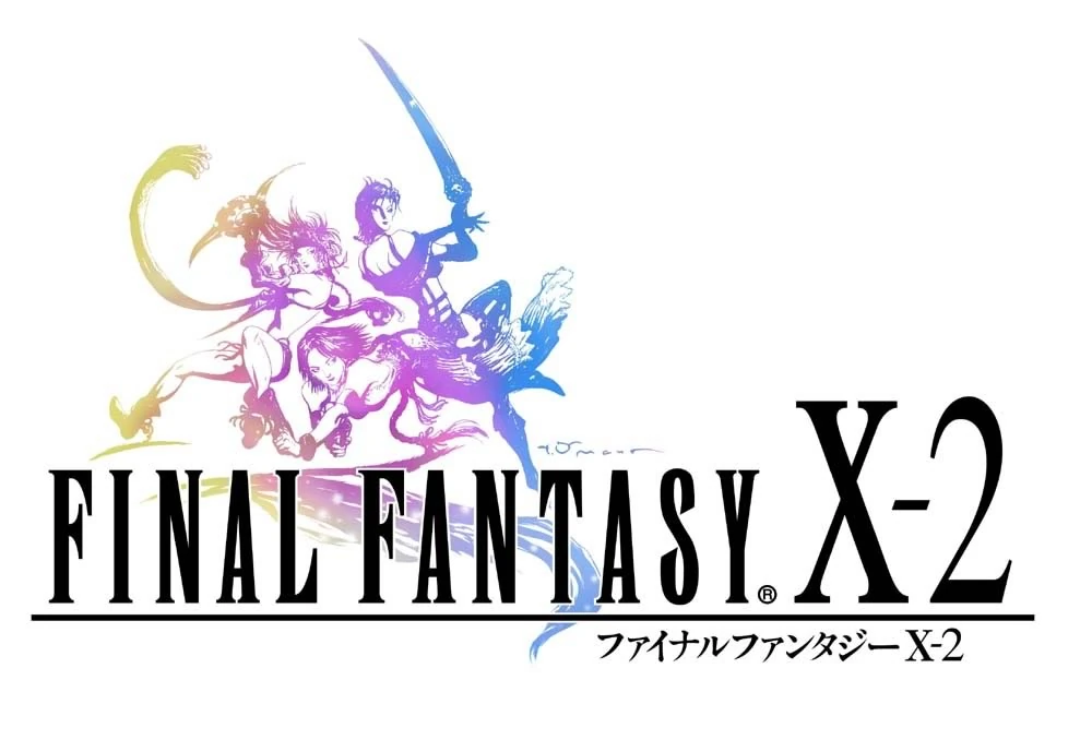
The logo of Final Fantasy X-2 features Yuna, Rikku, and Paine with the reverse color gradient of its predecessor's namesake. By coincidence, the scarf of Rikku's in-game character models have a similar gradient. Amano's signature is visible just to the right of Paine's extended leg. The logo of the Japan-exclusive International + Last Mission version features the same logo with the "International + Last Mission" text imposed on top of it.
Template:Gallery
- Final Fantasy Tactics
The logo of Final Fantasy Tactics is a group of soldiers, including a Black Mage, a Ninja, and a Knight. The font is altered, reminiscent of the early North American localizations, again with a sword replacing the first T and with the distinctive taper on the tail of the Fs; the font would become an official Tactics mainstay.
- Final Fantasy Tactics Advance
The logo of Final Fantasy Tactics Advance is a judgemaster (likely Cid Randell) on his chocobo.
- Final Fantasy Dimensions
The logo of Final Fantasy Dimensions features the characters Vata as a Warrior of Light and The Mask as a Warrior of Darkness. The artwork is done in a rainbow pattern. The game is called Final Fantasy Legends: Hikari to Yami no Senshi in Japan thus has a logo with different text.
Template:Gallery
Final Fantasy Mystic Quest.
- Final Fantasy Mystic Quest
The logo of Final Fantasy Mystic Quest features a new typeset with gilded letters in a style similar to other American Final Fantasy releases of the time.
Template:Gallery
- Final Fantasy: The 4 Heroes of Light
The logo of Final Fantasy: The 4 Heroes of Light features a new typeset in golden letters.
Template:Gallery
- Final Fantasy Explorers
The logo of Final Fantasy Explorers features various job classes taking on a dragon. The logo text does not use the usual font, and has a crystal substitute for the O in the word "explorers". The game's logo is designed by Amano.[5]
- Mobius Final Fantasy
The logo of Mobius Final Fantasy features the main protagonist wearing armor and wielding an ornate sabre. Behind him is a yellow figure-of-eight pattern. The logo was designed by Amano, and was designed around the concept of the Möbius strip.[6]
Template:Gallery
- Final Fantasy Grandmasters
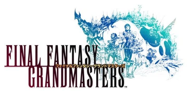
The logo for Final Fantasy Grandmasters resembles the logo for Final Fantasy XI by its colors, being a spin-off of the original Final Fantasy MMO. It features an airship with a city on its back, and the different races of Vana'diel.
Sub-series
Final Fantasy 20th Anniversary
- Final Fantasy 20th Anniversary
The Final Fantasy 20th Anniversary logo features an Amano drawing of Princess Sarah on top of a crystal. Other conceptual designs include a Warrior of Light and the Bomb enemy.
Template:Gallery
- Final Fantasy, 20th Anniversary Edition
The logo of the 20th Anniversary Eedition of Final Fantasy is similar to the original, featuring an Amano drawing of a Warrior of Light in light blue, but at an angle, facing the viewer slightly.
- Final Fantasy II, 20th Anniversary Edition
The logo of the 20th Anniversary edition of Final Fantasy II is also similar to the original, featuring an Amano drawing of The Emperor in pink, but with the Emperor looking directly at the viewer.
- Final Fantasy IV, 20th Anniversary Edition
The logo of the 20th Anniversary edition of Final Fantasy IV features an Amano drawing of Golbez. This logo is also used for the mobile and Steam releases of the game.
Dissidia
- Dissidia Final Fantasy
The logo of Dissidia Final Fantasy features Chaos and Cosmos, the two opposing one another. Yoshitaka Amano's signature is visible in the bottom-right corner of the image, near Chaos's leg.
Template:Gallery
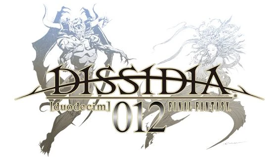
- Dissidia 012 Final Fantasy
The logo of Dissidia 012 Final Fantasy again features Chaos and Cosmos, each on the opposite side of their predecessor's logo artwork. Amano's signature is visible in the same place as before, this time just next to the end of Cosmos's gown.
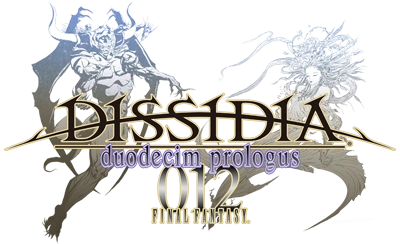
- Dissidia Duodecim Prologus Final Fantasy
The logo of Dissidia Duodecim Prologus Final Fantasy is almost identical to that of Dissidia 012 Final Fantasy, with slightly brighter colors. The text "duodecim prologus" appears in purple underneath the main text, replacing "[duodecim]" and forcing "FINAL FANTASY" onto the next line. Amano's signature is notably missing from this version.
- Dissidia Final Fantasy (Arcade)
The arcade version is based on the original Dissidia Final Fantasy logo. It has no artwork, the "Dissidia" text is purple and embossed, and there is a red lens flare in the middle.
- Theatrhythm Final Fantasy
The logo of Theatrhythm Final Fantasy parallels the Dissidia Final Fantasy logo with Cosmos and Chaos, albeit in a super-deformed style.
- Theatrhythm Final Fantasy Curtain Call
The logo of Theatrhythm Final Fantasy Curtain Call features Terra Branford, Zidane Tribal, Onion Knight, Bartz Klauser, Y'shtola and Vaan in the back row, while Shantotto, Tidus, Firion, Cloud Strife, Warrior of Light, Lightning, Squall Leonhart, Cecil Harvey and a moogle appear in the front row, Chaos and Cosmos are depicted in gold behind the characters in the same positioning as the Dissidia 012 Final Fantasy logo.
Template:Gallery
Compilation of Final Fantasy VII
- Compilation of Final Fantasy VII
The logo of Compilation of Final Fantasy VII is the original Final Fantasy VII logo, on a black background, and the words "Compilation of Final Fantasy VII" on Meteor.
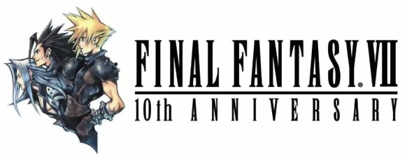
- Final Fantasy VII 10th Anniversary
The logo was used in 2007 to celebrate the 10th anniversary of Final Fantasy VII. It features Cloud Strife being flanked by Zack Fair and Sephiroth.
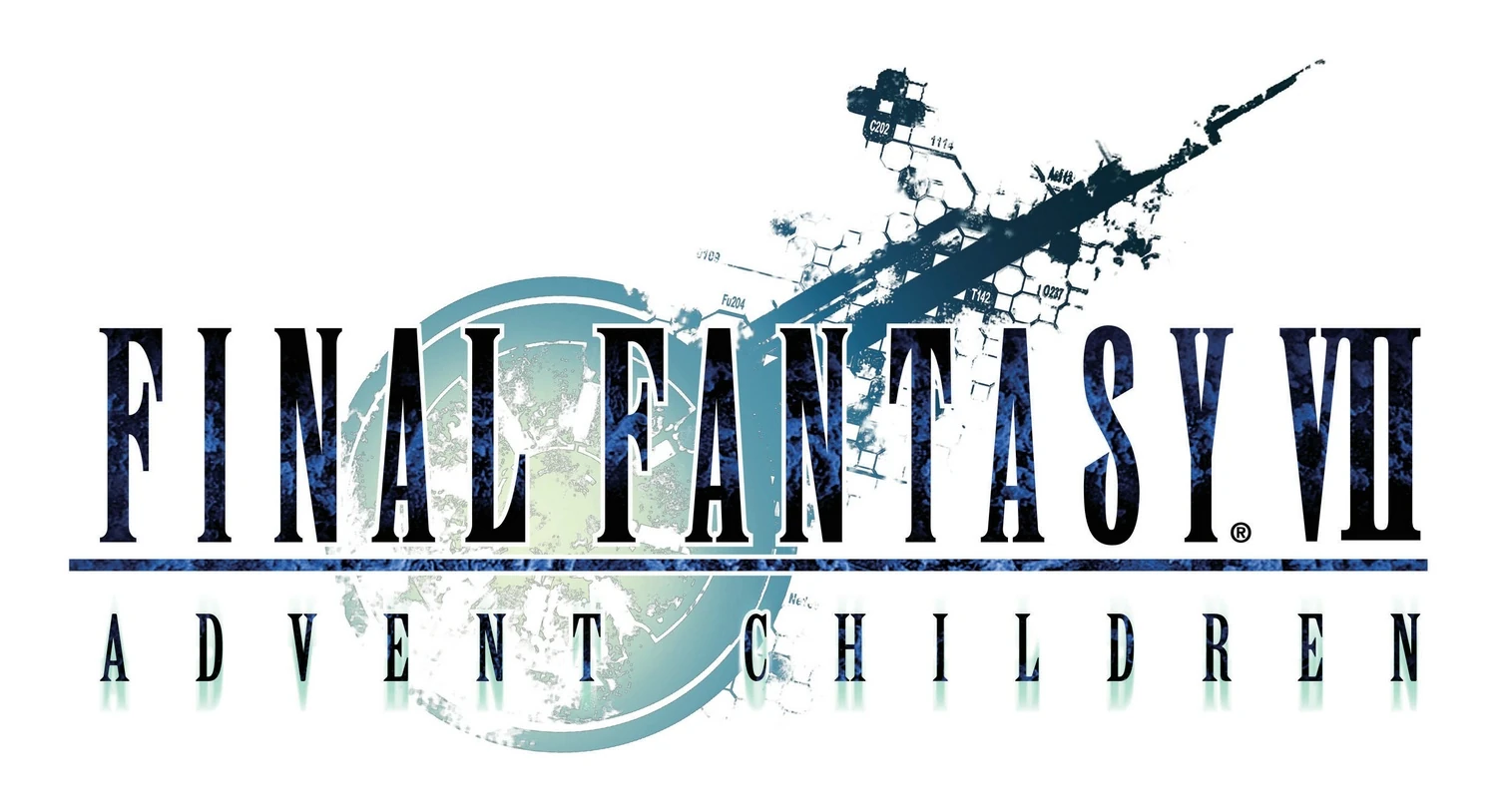
- Final Fantasy VII: Advent Children
The logo of Final Fantasy VII: Advent Children is a view of the ruins of Midgar matching the shape of the original Final Fantasy VII logo.
- Final Fantasy VII: Advent Children Complete
Basically the same as the Advent Children logo, but has added a dark blue box with the word "COMPLETE" below the original title.
- Before Crisis -Final Fantasy VII-
The logo of Before Crisis -Final Fantasy VII- depicts two of the main playable characters standing back to back. Who they are depends on which mobile game network the game was downloaded from.
- Crisis Core -Final Fantasy VII-
The logo of Crisis Core -Final Fantasy VII- is just the title, with a sky of clouds as the background. The game's logo is said to represent the game's central characters; the blue sky symbolizes Zack Fair, the main protagonist; the white feather is a symbol of Angeal Hewley, Zack's mentor; and the water represents Aerith Gainsborough, Zack's love interest.[7]
The logo appears in the North American and PAL versions' game cover without the blue background.
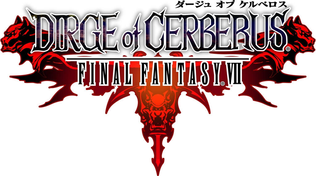
- Dirge of Cerberus -Final Fantasy VII-
The logo of Dirge of Cerberus -Final Fantasy VII- is a representation of Cerberus, the creature Vincent named his gun after.
Template:Gallery
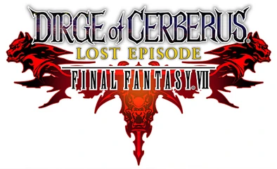
- Dirge of Cerberus Lost Episode -Final Fantasy VII-
Identical to the main game's logo, except for the words "Lost Episode" placed between the two lines of the title in gold lettering.
- Last Order -Final Fantasy VII-
The logo of Last Order -Final Fantasy VII- is the title of the OVA, with the words "Last Order" colored in a similar style to the numeral in the logo of Final Fantasy IX. The gradient underline previously seen in logos such as Final Fantasy and Final Fantasy II is also used.

- Final Fantasy VII: Snowboarding
The logo of Final Fantasy VII: Snowboarding is the Final Fantasy VII typeset over a stylized "Snowboarding" subtitle in shades of blue and white.
- Final Fantasy VII G-Bike
Final Fantasy XI expansion packs
On the game's login screen, the logo of each expansion is displayed, illuminated if owned by the player or watermarked if not.
Template:Gallery
Fabula Nova Crystallis: Final Fantasy
- Fabula Nova Crystallis: Final Fantasy
The logo of Fabula Nova Crystallis: Final Fantasy features a goddess wearing grand clothing, with wings and a crystal sphere at the bottom of her feet (next to which Amano's signature is visible). The main title is done in black with white borders, while the second half is white inside a black bar. The original logo bore the "XIII" numeral: this was removed after Final Fantasy Agito XIII was renamed Final Fantasy Type-0.[8]
Template:Gallery
- Final Fantasy XIII-2
The logo of Final Fantasy XIII-2 features Lightning in a suit of armor and her fated rival, Caius Ballad. The text is outlined in a color that matches the artwork. Amano's signature is visible under Lightning. According to an interview with Isamu Kamikokuryo about the game's art direction, the colors pink and purple came up a lot, and consequently, they are the colors in the logo.[9] Lightning and Serah with their rose-colored hair represent pink, while Caius has a purple set of armor, purple hair and can transform into a purple Chaos Bahamut.
Template:Gallery
- Lightning Returns: Final Fantasy XIII
The logo of Lightning Returns: Final Fantasy XIII differs from the Final Fantasy norm and from the other logos in the Fabula Nova Crystallis: Final Fantasy series by not featuring a Yoshitaka Amano artwork and not using the usual typeface. It features an emblem that resembles a crystal and the text has a crystalline texture to it. There are also patterns in it resembling lightning bolts, likely relating to the game's heroine. In-game this is the crest of the savior.
Producer Yoshinori Kitase has explained that the title logo was revamped because the team wanted to convey the "newness" of the installment compared to previous Final Fantasy games. The intention was to use an emblem with sharp edges and a symmetrical design.[10]
Template:Gallery
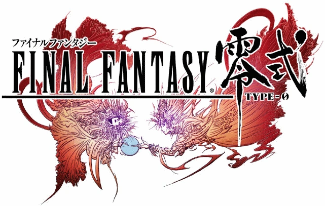
- Final Fantasy Type-0/Agito
The logo of Final Fantasy Type-0 features the goddess Diva, with both "aspects" of her touching a crystal sphere. The kanji word (零式, reishiki?, lit. Type-0) was drawn by Yusuke Naora, while the main artwork was designed by Amano.[11][12] The text is done in black with white borders. The original logo, when the game was named Agito XIII, has text in outlined in a color that matches the artwork, which is done in paler shades than the Type-0 artwork. The logo for its HD release is also identical to the original, except with the color of the artwork changed to gold surrounded by sparkling particles, the kanji "Final Fantasy" removed from above the main text and "HD" added after the Type-0 kanji in a style similar to some types of Japanese calligraphy.
The change in the game's coloring tone from the original red to the golden tone in the HD remake was not completely planned from the beginning, but came from the new logo. Yusuke Naora designed the new logo as per diretor Hajime Tabata's request, and the team decided to unite the presentation of the new game under the golden tone from the new logo, although this could not be carried out exactly as it made the game too dark in places to see all the details.[13]
The logo of Final Fantasy Agito is virtually unchanged from its previous incarnations, being the same image with an altered, bright pink-to-red color-palette, and surrounded by a crimson blur. While the main title is done in the Runic MT Condensed format common to the series, the word "Agito", which dominates the title, is done in an oriental style similar to the HD moniker for Type-0. The text of the Agito+ logo is identical except for the addition of the "+" sign and the katakana for "plus" in the text. The color is also altered to various shades of blue and white. The logo for Final Fantasy Type-0 Online again uses the Amano design, with the "Online" done in a similar style to Agito.
The scene of the two Divas touching a crystal orb with moving clockwork cogs inside is depicted in the original game's intro. The orb symbolizes Orience, the world of Final Fantasy Type-0.
Template:Gallery
Final Fantasy XV Universe
Template:Sideicon Final Fantasy XV started as a Fabula Nova Crystallis game but eventually spun its own series of releases.
- Brotherhood -Final Fantasy XV-
The anime prequel to Final Fantasy XV as the silhouettes of Gladiolus Amicitia, Noctis Lucis Caelum, Ignis Scientia and Prompto Argentum against the logo text.
- Kingsglaive: Final Fantasy XV
The logo for the accompanying movie, Kingsglaive, has the film's name in the series' font with the V in "Kingsglaive" as an insignia.
Finest Fantasy for Advance
The logo of Finest Fantasy for Advance is a simple black and white box.
Template:Gallery
Ivalice Alliance
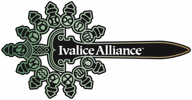
Ivalice Alliance
The logo of the Ivalice Alliance features a sword surrounded by the thirteen Zodiac signs, a recurring theme in Ivalice-based games.
- Final Fantasy XII International Zodiac Job System
The logo of Final Fantasy XII International Zodiac Job System was painted by Yoshitaka Amano. It shows off the five Judge Magisters in the game.
- Final Fantasy XII: Revenant Wings
The logo of Final Fantasy XII: Revenant Wings features the Galbana flying through the sky. The logo was designed by Isamu Kamikokuryo.
- Final Fantasy Tactics: The War of the Lions
The logo of Final Fantasy Tactics: The War of the Lions features a drawing of two opposing sides fighting each other. It includes a Time Mage, a Dragoon, a White Mage, an Onion Knight, a Ninja, a Black Mage, a Summoner, an Archer and a chocobo.
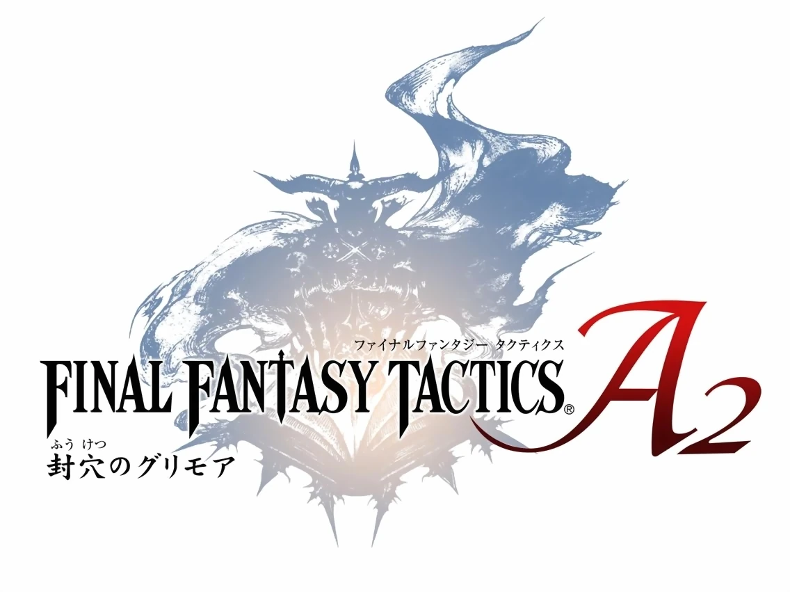
- Final Fantasy Tactics A2: Grimoire of the Rift
The logo of Final Fantasy Tactics A2: Grimoire of the Rift features a drawing of a Judge and a Grimoire.
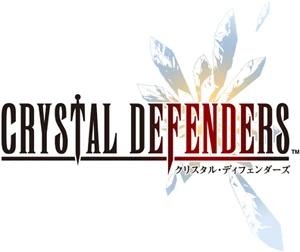
- Crystal Defenders
The logo of Crystal Defenders features a blue and peach crystal with the title in a red gradient.
Template:Gallery
- Crystal Defenders: Vanguard Storm
The logo of Crystal Defenders: Vanguard Storm is similar to its predecessor, though the subtitle is in a diamond font.
Final Fantasy Crystal Chronicles
- Final Fantasy Crystal Chronicles
The logo of Final Fantasy Crystal Chronicles is a Myrrh Tree. The swooping, crescent shaped C's of this original logo would become a staple of the Crystal Chronicles series.
- Final Fantasy Crystal Chronicles: Ring of Fates
The logo of Final Fantasy Crystal Chronicles: Ring of Fates spells out the game title is a stylistic red font, with a gem on a chain hanging from the leading leg of the R in the word "ring."
Other logos include a picture of the twins Yuri (left) and Chelinka (right), as well as as the arch of a stained glass window. However, neither of these are consistent in the different versions of the game's box art.
- Final Fantasy Crystal Chronicles: My Life as a King
The logo of Final Fantasy Crystal Chronicles: My Life as a King is a silhouette of King Leo and the Kingdom of Padarak.
Template:Gallery
- Final Fantasy Crystal Chronicles: Echoes of Time
The logo of Final Fantasy Crystal Chronicles: Echoes of Time includes a picture of the cat that Sherlotta uses as a substitute body and a crystal.
- Final Fantasy Crystal Chronicles: My Life as a Darklord
The logo of Final Fantasy Crystal Chronicles: My Life as a Darklord is a stylized font with many angled letters and serifs, written in a gradient from pale pink to deep purple. The image behind the title also uses various pinks and purples.
Template:Gallery
- Final Fantasy Crystal Chronicles: The Crystal Bearers
The logo of Final Fantasy Crystal Chronicles: The Crystal Bearers reuses the light blue font used in the original Crystal Chronicles title of Final Fantasy, and spells out the game's sub-title in a heavily stylized yellow font which spills over into the final four letters of "fantasy."
Template:Gallery
Compilations
- Final Fantasy I∙II
The logo of Final Fantasy I∙II is simple with no background image and the text is in blue. This was the first time Final Fantasy and Final Fantasy II were released with the modern typeset for their logos.
- Final Fantasy Origins
The logo of Final Fantasy Origins includes the title in the familiar typeset, plus the colors of the logos from the original Final Fantasy and Final Fantasy II in the underline.
- Final Fantasy I & II Dawn of Souls
The Final Fantasy I & II: Dawn of Souls includes the logos of the original Final Fantasy and Final Fantasy II on either side of the main Dawn of Souls logo, with a crystal behind it.
Final Fantasy Collection logo.
- Final Fantasy Collection
The Final Fantasy Collection logo is simple with the Final Fantasy text with the word Collection under it.
- Final Fantasy Chronicles
The Final Fantasy Chronicles logo is basic with only the text "Chronicles" added to the main logo.
- Final Fantasy IV: The Complete Collection
The Final Fantasy IV: The Complete Collection logo is the basic Final Fantasy logo with the Complete Collections text added to it, without a background image.
- Final Fantasy Anthology
The Final Fantasy Anthology logo is written in bronze color instead of black and has an embossed rather than flat look, but otherwise is similar to other Final Fantasy series logos. The typeset used is Birch STD, rather than the regular series typeset which is based on Runic MT.
- Final Fantasy X / X-2 Ultimate Box
A compilation pack from Square's Ultimate Hits series, including Final Fantasy X and its sequel, Final Fantasy X-2 for the PlayStation 2. This was made available to Japan only.
- Final Fantasy X | X-2 HD Remaster
The Final Fantasy X/X-2 HD Remaster logo is composed of logos for Final Fantasy X and Final Fantasy X-2 respectively. It has written "HD Remaster" in a solid steel color on a transparent light blue bar.
Other
Final Fantasy 25th Anniversary
The Final Fantasy 25th Anniversary logo features a moogle sitting on a small throne atop a chalice. The letters have a gold gradient while "25th" is in a red gradient.
Other logos
Template:Gallery
Trivia
- Yoshitaka Amano signed his Final Fantasy X, X-2, XII, XII International Zodiac Job System, XIII-2, Dissidia, Dissidia 012, and Fabula Nova Crystallis logos.
Reference
- ↑ 1.0 1.1 1.2 1.3 1.4 1.5 1.6 The Art That Shaped Final Fantasy: Thoughts From Famed Artist Yoshitaka Amano (Accessed: UnknownError: See this for how to archive.) at Game Informer)
- ↑ 2.0 2.1 2.2 http://finalfantasynews.com/2015/02/27/yusuke-naoras-smu-lecture-recap-featuring-new-final-fantasy-xv-concept-art/
- ↑ Final Fantasy Versus XIII – all the details so far (Accessed: October 27, 2014) at Gematsu
- ↑ 16 More Things We Learned About Final Fantasy 15 (Accessed: August 30, 2015) at Gamespot
- ↑ 3DS『ファイナルファンタジー エクスプローラーズ』FF11/14のライト版的な内容、登場ジョブ約20種、アビリティ付替可能、100~200時間は遊べる。シリーズ展開も視野? (Accessed: October 27, 2014) at GamesTalk
- ↑ http://app.famitsu.com/20150402_511025/
- ↑ Crisis Core -Final Fantasy VII- Ultimania, p.{{{page}}} (incomplete citation)
- ↑ Kitase and Toriyama Talk FFXIII-2 and Fabula Nova Crystallis (Accessed: October 27, 2014) at Andriasang
- ↑ Final Fantasy XIII-2 Roundtable: Art and Music (Accessed: October 27, 2014) at GameSpot
- ↑ Square Enix On Bringing Lightning Returns To Life (Accessed: October 27, 2014) at Kotaku
- ↑ Latest on Final Fantasy Type-0 (Accessed: October 27, 2014) at Andriasang
- ↑ Yoshitaka Amano Artwork Featured on Final Fantasy Type-0 Soundtrack (Accessed: October 27, 2014) at Andriasang
- ↑ http://jpgames.de/2015/02/jpgames-de-unser-interview-mit-hajime-tabata/
Template:Recurring Elements